This house needs a new bathroom arrangement. The old master bath and guest bath are back-to-back. Both are small. The long term goal is to make the master bath larger by stealing some dead space from the guest bath, and to open up the guest bath by removing a separating wall & door between the toilet and sink.
A separate entry will describe the prosess up to now.
What is wrong with the old guest bath?
- Wall separating toilet/tub from sink; makes both spaces cramped and closet-like in feel. It leaves no natural light to counter and sink area.
- No fan, which leaves the room damp when used for the shower; the toilet area is aired out only if the window is open. "fumes" can be noted in the main hallway.
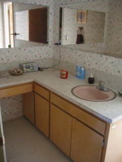
- Odd shaped counter, taking space without providing much useful function.
- Drawers bang into each other when opened.
- The current drop-in sink on counter with small tiles (so lots of grout) is a hassle to clean. Too many nooks an crannies for dirt and mildew.
- The toilet is damaged.
Goals for improved guest bath:
- Despite loss of some floor space, the room will seem larger and brighter after the dividing wall is removed.
- There will be a fan.
- Current plan is for a porcelain pedestal sink, avoiding the nooks and crannies in the current version.
- New toilet, hoepfully a high-functioning water saving model.
Photos below show the physical work to date, including original layout (so small I was unable to take photos showing the toilet/tub area), and the counter, sink, and diviging wall going / going / gone.

Original Counter and Sink. Toilet / tub area is too small to take a photo showing the area. The toliet is on the other side of the wall, behind the sink and mirror in this photo.

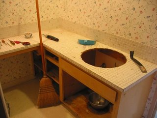
Going

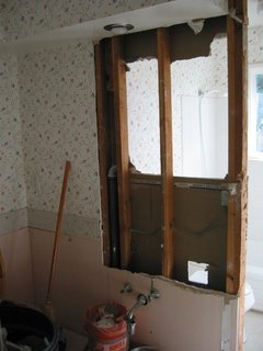
Going

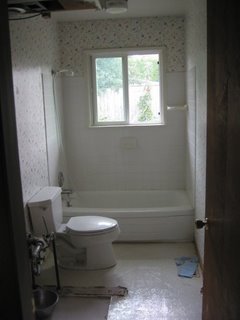
Sink, counter, doorway, and wall are gone. Still a lot of deconstruction remaining, however. Wow- it's much brighter now.

No comments:
Post a Comment
Note: Only a member of this blog may post a comment.